Projects
Degoogling cost me my YouTube feed, so I made my own
I dropped the YouTube app and rebuilt only my subscriptions feed as a self-hosted Cloudflare Worker that reads each channel's RSS, no API key, no tracking.
Write-up TechTech
Moving the blog stack to Europe (kind of)
How I moved a Hugo blog from GitHub Pages to a Hetzner box in Europe, switched object storage to Cloudflare R2 EU, and what I kept on US infrastructure.
Write-up TechTech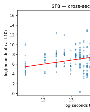
The Anatomy of a Decentralized Prediction Market: Notes from the Polymarket Order Book
A 624 GB tick-level archive of Polymarket's WebSocket feed joined to the on-chain trade record reveals eight cross-sectional stylized facts and a measurement result: the public feed only recovers trade direction 59% of the time.
arXiv Quantitative FinanceQuant
F3ED Can't Call an Ace: Fixing a NeurIPS 2024 Tennis Model
F3ED, the NeurIPS 2024 tennis shot detector, mislabels 73% of single-shot serve unforced errors. A 23-line scoreboard OCR reconciler fixes them.
Code AIAI
Against All Odds: The Mathematics of 'Provably Fair' Casino Games
Statistical analysis of 20,000 crash game rounds verifies the 97% RTP claim. But 179 rounds per hour means expected losses exceed 500% of wagers hourly.
SSRN Quantitative FinanceQuant
Social Media Success Prediction: BERT Models for Post Titles
Training RoBERTa to predict Hacker News success revealed temporal leakage inflating metrics. How temporal splits, calibration, and regularization fix it.
Code AIAI
65% of Hacker News Posts Have Negative Sentiment, and They Outperform
Sentiment analysis of 32,000 Hacker News posts shows 65% skew negative and earn 27% more points. Six transformer and LLM models tested, full data included.
Code AIAI
RSS Swipr: Find Blogs Like You Find Your Dates
Build an open-source ML RSS reader with swipe interface. Uses MPNet embeddings and Thompson sampling for personalized feeds that escape the filter bubble.
Code AIAI
Building a No-Tracking Newsletter from Markdown to Distribution
Build a privacy-focused newsletter with Python, Cloudflare Workers KV, and Resend API. Zero tracking, zero cost, full control. Open source code included.
Code TechTech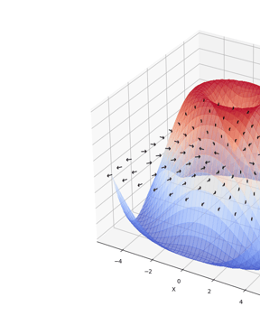
Visualizing Gradients with PyTorch
Build the right mental model for gradients with this PyTorch visualization tool. 2D surface plots with gradient vectors show the direction of steepest ascent.
Code TechTech
Counting Cards with Computer Vision
How I trained a YOLOv11 model to detect playing cards at 99.5% accuracy and built a real-time Monte Carlo blackjack odds calculator using computer vision.
Code TechTech
Modeling Glycemic Response with XGBoost
A hands-on project predicting postprandial glucose curves with XGBoost, Gaussian curve fitting, and 27 engineered features from CGM data. Code on GitHub.
SSRN TechTech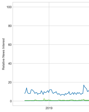
Trading on Market Sentiment
GPT-3.5 matched RavenPack's 41% returns in a sentiment analysis trading strategy using 2,072 news headlines. See the full backtest results and comparison.
Code AIAI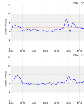
I Built a CGM Data Reader
Built a CGM data analysis tool with Python to visualize Freestyle Libre 3 glucose data alongside nutrition, workouts, and sleep for endurance cycling.
Code TechTech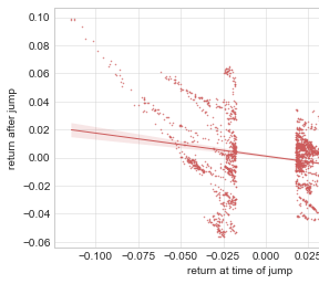
Crypto Mean Reversion Trading
How I built a crypto mean reversion trading bot using PELT change point detection on Kraken, targeting altcoin price overreactions with automated execution.
Write-up InvestingInvesting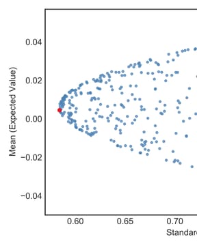
My First 'Optimal' Portfolio
How I built Python portfolio optimization tools, tripled the Sharpe ratio from 0.65 to 1.68, and published the results as an academic paper on MPT.
SSRN InvestingInvesting
The Tech behind this Site
A Hugo blog tech stack with Cloudflare R2 image hosting, responsive WebP shortcodes, Workers AI social automation, and GitHub Pages CI/CD deployment.
Code TechTechAbout these projects
- What domains does Philipp Dubach work in?
- Quantitative finance (market microstructure, portfolio construction), machine-learning systems, computer vision, and the occasional hardware experiment. Several builds have been formalized as peer-reviewed papers and pre-prints with DOIs on SSRN and arXiv.
- Are the projects open source?
- Yes. Every project ships with a public repository, a write-up, and reproducible data when sharing it doesn't break licensing or privacy.
- Where can I find the code and papers?
- Each row links to its full write-up; format tags (Paper · arXiv / SSRN · Code · Hardware) link out directly to the artifact's home — arXiv abstract, SSRN page, or GitHub repo.